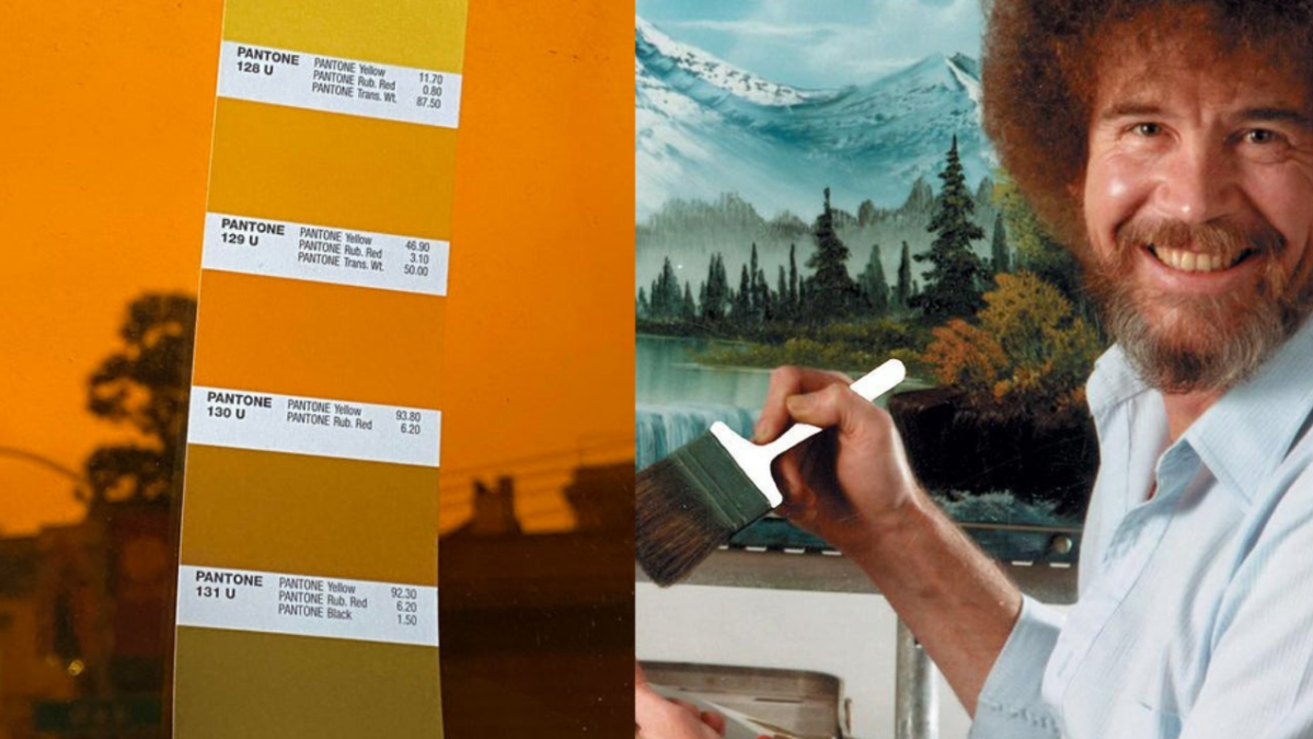
We have now found the perfect colour to paint the skies of the year of our apocalypse, 2020. Looks like a healthy shade of ‘Pantone 130 U’ seems to be the best bet.
Posted by user dex110 in the r/Design page of Reddit, this image shows us the most accurate colour to portray 2020, given all the fires that have made our skies look completely dystopian.
Although the photo was taken underneath an LA sky, the image doesn’t look too different to how Aussie skies looked back at the start of the year. Seems like ‘Pantone 130 U’ is the best colour for all of us.
The fires in LA started after some wretched gender reveal went completely botched. Although all of LA now know the gender of this god-forsaken child, over 30 square kilometres of land have been burnt up, with over 3,000 people being evacuated from their homes.
#ElDoradoFire @CALFIRERRU handcrew pic.twitter.com/cVRpQ4S8JQ
— Kyle A (@449photo) September 6, 2020
On Monday, fires in the Washington state scorched around 330,000 acres. That single day record came down to more than the total amount burned in each of the 12 previous annual fire seasons. Thanks, gender reveals.
Meanwhile skies over the town of Salem and Stayton, south of Portland, as well as Depoe Bay, have taken a much scarier shade. Something tells me that if you want to paint a picture of Salem, you’re gonna need a lot more Pantone red in that bucket.
The witch trials must be back on or something because this is downright horrifying.
https://twitter.com/odie1kenodi/status/1303446101987676164?s=20
#OregonFires Enchanted Forest in Salem Oregon looks downright Apocalyptic today. pic.twitter.com/DzgaJzuoFo
— Atypical♥️ (@atypicaljesse) September 8, 2020
Pantone, I am begging you, change this colour to the official colour of the year you cowards.