
There are two likely scenarios that lead to the release of Donald Trump’s undeniably phallic campaign logo: either every single person who vetted the thing thought the virtues of freedom and liberty would be imparted by some penetrative typography, or a 17-year-old graphic design intern simply managed to convince the aforementioned supervisors that “no, sir, that’s totally not a dick.”
ICYMI, here’s the animated version:
Breaking the mattress of America. pic.twitter.com/M4Cq62YS2c
— Full Frontal (@FullFrontalSamB) July 15, 2016

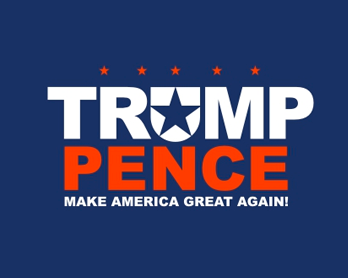
Well, in an uncharacteristic admission of defeat, that logo has been stripped from the Don’s website and all social media channels. In its place, this utilitarian slab of text has been doled out to the American people – no flag, no wang, no nothin’ – in an attempt to secure their vote:

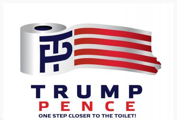
Of course, that just ain’t any fun. In response, users of logo-sharing site LogoMyWay have been busy creating some alternative takes for the presumptive Republican nominee’s iconography. As it turns out, we shouldn’t have even been focusing on the dick-like nature of the initial layout: the initials stand for toilet paper, which is tremendously juvenile in its own right.
It’s worth noting at this point that Mike Pence, Trump’s selected running mate and the, uh, “catcher” in the original logo has long been a staunch opponent of reproductive rights for women. Perhaps on that basis, it was inaccurate to depict his name as anything close to a vajayjay in the first place.
Source: ABC.
Photo: Drew Angerer / Getty / donaldjtrump.com.