
Prime Minister Scott Morrison is incompetent at the best of times, but when it comes to building literally any rapport or relationship with women, it’s actually bizarre how much he continues to fuck it up astronomically. This time, by giving the new “Women’s Network” a whole penis for a logo. Satire is dead.
The Prime Minister and Cabinet’s Women’s Network is supposed to empower women and promote gender equality in the workforce.
According to its website, “the network priorities are founded on driving cultural change and encouraging men to drive this cultural change, particularly in areas where men can make a significant contribution.
“The network promotes women’s career success by facilitating opportunities for learning, networking and career mobility and encouraging flexible approaches to work.”
Except none of those words made a single impact on me once I saw the logo for the Women’s Network, which is unequivocally a penis and a pair of balls.
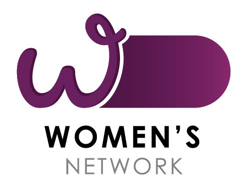
There’s even a curly little pube at the top. How feminist.
Now, I know. Penises are not exclusively male, and gender identity exists separately to genitalia. But I really doubt the Federal Government was aware of that nuance or that it was trying to be inclusive of trans and intersex women when this logo was approved.
Critics online don’t seem to think so anyway, with people either calling it a gravely ignorant mistake or a purposeful dig at women’s spaces.
Boss: “Hey, Bob? We need a logo for that annoying women’s network—”
Bob: “Oh I know—I’ll draw a picture of my cock and I can round out the W to hint at my balls nesting right there—yeah, that works.”
Far. Out. #auspol #EnoughIsEnough https://t.co/R50TyszUvc
— Jenny Frecklington-Jones #VotedYes ❤️💛🖤 (@JonesHowdareyou) March 13, 2022
Yes @JaneCaro this PM&C “Women’s Network” logo looks like a cock & balls. It satirises what all women and men of goodwill are trying to achieve: the empowerment of women, equal rights and an end to a culture of violence, sexual assault and misogyny. pic.twitter.com/ejzgjgQDAc
— Quentin Dempster (@QuentinDempster) March 13, 2022
One Twitter user aptly described the logo as reeking of “teenage boy malevolence”.
Why have the juvenile idiots in your department made male genitalia out of the Women’s Network logo?
How hilarious. Let’s degrade women. Again.
Anybody who understands graphic design knows this is deliberate.
Anybody who didn’t catch this isn’t doing their job.
— RonniSalt (@RonniSalt) March 13, 2022
Even if it was somehow a genuine mistake, how on earth did no one catch this? It’s the milkshake consent debacle all over again.
Others described it as a tampon, though I don’t know if that’s better or worse. Both images invoke strong cis-normative ideas of gender and both of them are shit.
It’s only March and my 2022 bingo card is full.


