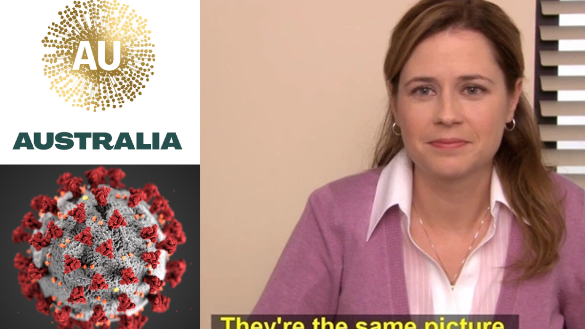
Remember two months ago when the new logo for Australia’s national brand was revealed and it looked exactly like the goddamn coronavirus? So do the people responsible for thinking it up, it seems, because the whole project’s just been quietly scrapped reconsidered.
According to The Australian, there is “no way” the final logo will be the one we were shown back in July. However the design, which is supposed to resemble wattle, apparently won’t be getting a complete overhaul, either.
That means we may still get a hint of coronavirus in the finished product, perhaps incorporating some kind of virion-adjacent geometry.
“Obviously COVID means there’s a need to have a look at that piece of work – particularly the logo element – given some of the associations people were drawing,” Trade Minister Simon Birmingham told 2GB.
“And so a careful look will be had before anything else is done with that in the future.”
This whole debacle has so far cost $10 million. Maybe for another ten mill we can end up having the logo resemble some other horrific disease, instead.
“The initial work by business leaders to inform Australia’s overall international branding was completed at the end of last year,” Birmingham added.
“The impact of the pandemic will be considered before it is finalised.”
Back when the logo was unveiled, the report that came along with it had this to say: “The contemporary, pan-Indigenous design is a unique symbol that depicts recognisably ubiquitous and timeless Aboriginal art elements – dots of irregular shape and placement, their spontaneous circular distribution following radiating lines and clustered configurations.”
That sounds like a heaps complicated way of spelling Ms Rona, to me.


