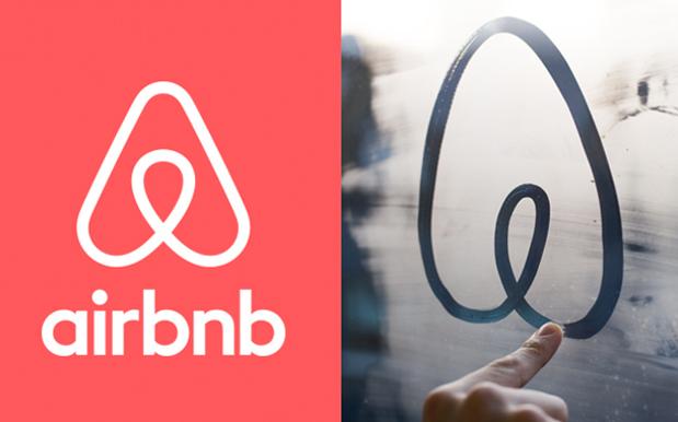
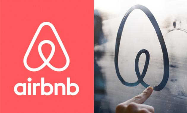
Wildly popular please-fill-my-spare-room-with-tourists web service Airbnb is going through a bit of an image redesign at the moment, upgrading their website with a slick new look and presenting a new image that encapsulates what the company is really all about. To go along with this, they’ve also designed themselves a new logo, one that’s instantly recognisable and can be drawn anywhere, anytime, by anyone. And they’ve certainly achieved that goal.
AirBnB emails with illustrated explanation of its new logo: pic.twitter.com/JqQRUzpf3q
— Alex Kantrowitz (@Kantrowitz) July 16, 2014
Although people are already having a wee bit of fun with it.
ok this changes everything @Airbnb pic.twitter.com/soyqm9vwLW
— darth™ (@darth) July 16, 2014
The Thought Process Behind the new #airbnb logo pic.twitter.com/pUEps6e5Ik
— Shaun Pendergast (@ShaunPendy) July 16, 2014
Where have I seen the Airbnb logo before? pic.twitter.com/GDjlwsvgMC
— Visual Idiot (@idiot) July 16, 2014
The new campaign also includes this slick looking video presentation, complete with flashing, brightly coloured animation and finger plucked acoustic guitar with accompanying glockenspiel.