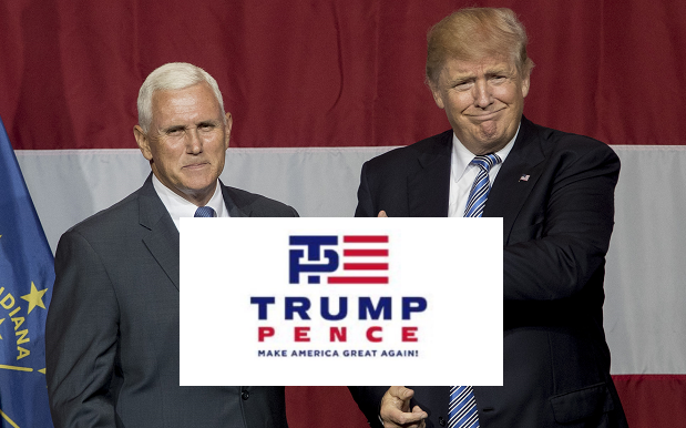
Donald Trump unveiled the new logo for his looming presidential campaign overnight, after selecting former Indiana governor Mike Pence as his running mate. It has all the standard features: it’s red, white and blue. Make America Great Again is emblazoned along the bottom. The clever little buggers who designed it even made sure it resembled the flag.
There’s only one flaw: Political commentators were certain the only thing getting fk’d by Trump’s VP pick would be Chris Christie’s ego. Oh no. That P in Pence seems to be taking an absolute pounding from the Trump Tower, and the internet wasted zero time pointing out the logo’s smutty implications:
I hope it’s not too late for Trump to pull out of this logo design. pic.twitter.com/dpqebAsgzp
— Chris Korman (@Kormanation) July 15, 2016
https://t.co/h2Ui0f0YY6 pic.twitter.com/VXX44UGiGd
— Anthony De Rosa (@AntDeRosa) July 15, 2016
“I don’t get it.”
“It’s the T…the way it goes into the P…”
“I don’t see it.”
“It looks like–“
“Yeah? WHAT?”
“Nothing, Mr. Trump.”— Mark Harris (@MarkHarrisNYC) July 15, 2016
— Bobby Solomon (@thefoxisblack) July 15, 2016
Other outlets have taken a slightly more academic approach to it. Slate ponders “in this relationship, Trump is on top.
That he has chosen to thrust his dom top power preference onto the American flag itself ably signals what he intends for our country.We will take his leadership, and we will like it.”
Breaking the mattress of America. pic.twitter.com/M4Cq62YS2c
— Full Frontal (@FullFrontalSamB) July 15, 2016
Fun fact: “Trump Pence” is itself an anagram of “Recent Pump”. It’s also an anagram of “Prep Me C…”… actually, let’s just stick with “Recent Pump”, yeah?
Source: The Daily Beast / Slate.
Photo: Aaron P. Bernstien / Getty.