By now you’ve no doubt seen the Western Bulldogs unveil their superhero-themed alternative jersey, which the side will wear in next week’s Opening Round of the 2019 Men’s AFL season. You’ve also probably screamed about it for one reason or another as well.
[jwplayer qW8VIDvr]
But though we may all protest about how football tradition is being thrown under the bus for the sake of a cheap buck, it’s worth noting that the 18 AFL clubs have a long, proud, and putrid history of putting out truly garbage alternative uniforms for little to no reason.
Observe the following collection from recent years, critiqued in a balanced and definitely not wholly ridiculous manner.
BASICALLY ANYTHING HAWTHORN’S EVER PUT OUT
Every alternative Hawthorn jumper design ever released sucks so much ass that it’s impossible to single out just one, so let’s speed round through three of the worst.
THE PINK STRIPES
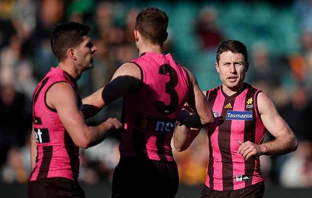
Sure, it was for cancer awareness, but it looks more like someone shoved a Kitchenaid Pasta Attachment up their coight and tried heave themselves into orbit.
THE WHITE POWER RANGER
The only MegaZord these atrocities could summon is a 50-foot robotic Jeff Kennett that glowers at every woman within 500 yards.
MAXIMUM CAMO
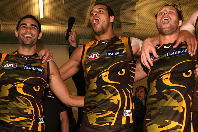
Only would’ve been acceptable if they’d fully embraced the camo, gone all out hardcore bro, and changed the club’s theme song to Keepers Of The Faith by Terror.
THE PURA MILK SAINTS
Nothing says “extremely tough professional football team” like the cheddar yellow of Pura Lite Start: The official milk of department store staff rooms and anyone who’s ever been referred to as “Aunty Rhonda.”
CARLTON’S CONCRETE PYJAMAS
I love to look like a Grade 8 sleepover party that pinched Mum’s debit card and went apeshit at the Best & Less stocktake sale. I love to look like that even more while getting bashed by 12 goals every week. It’s great. To me, it’s fantastic.
THE ESSENDON SEATBELT FIASCO
That the seatbelt was *undone* on these simmering pieces of shit is about as good a metaphor for Essendon’s car crash period between firing Kevin Sheedy and Kärcher-ing the unfortunately-timed “WHATEVER IT TAKES” sign off the side of Windy Hill as you’re ever likely to see.
ALL GOLD COAST STRIPS EVER
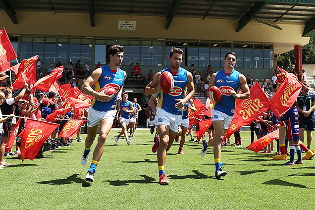
They all suck. Every jumper they’ve ever put out blows. The logo looks like it was made in Microsoft Word. The colours look like various stages of sunburn. Fold club, give licence to Tassie, etc etc etc.
WHATEVER THIS BULLSHIT EAGLES ONE IS
Honestly, this is one 21-year-old’s gutsy op-shop purchase away from featuring in 38% of all Instagram posts made at any given Greta Van Fleet show.
WESTERN BULLDOGS SUPERHERO STRIP
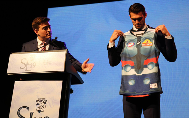
Utterly bafflingly that they chose the Norse God Man over the unnamed red, white, and blue American Captain which was literally right there.
FREMANTLE’S PERTH STADIUM THING
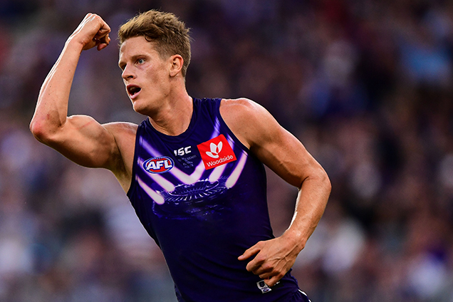
There are only three occasions where a group of people wearing their own house on the front of a shirt is acceptable:
- Appearing on Family Feud.
- Moving out/empty house party at your first sharehouse.
- While bawdily bullying a close friend into getting ethanol poisoning after 18-hours on the Bintangs in Kuta.
GWS ANZAC DAY CAMO
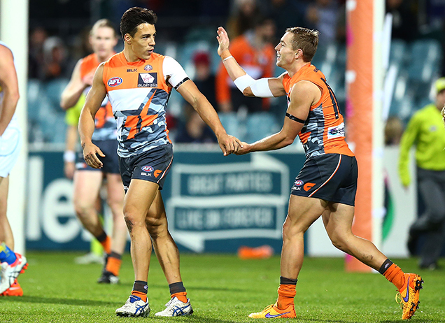
High vis and camo perfectly cancel each other out meaning by all rights this strip should’ve made all players wearing them appear nude. Then there’s the silhouette of the digger standing in front of the Telstra Tower graphic and there’s absolutely a gag to be made here about WAR and CAPITALISM but literally who’s got the time?
ADELAIDE’S PISS YELLOW STRIP
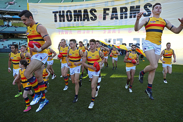
At some point the club progressed from this absolute steamer to a similar version that had white as the base colour. Presumably this was after they drank a shedload of water and weren’t quite so dehydrated.
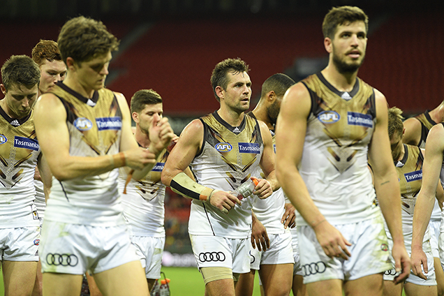
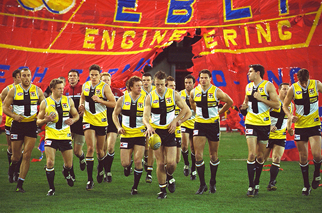
RICHMOND’S BIGGER PISS YELLOW STRIP
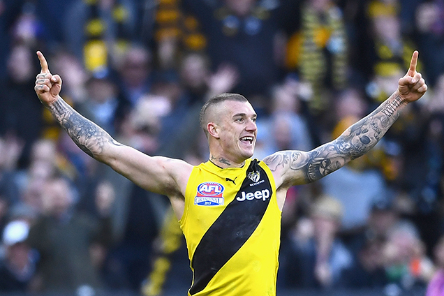
Similarly, in 2017 Richmond decided to shelve half a bottle of Berocca tablets and piss out this number. Imagine having an eons-old, traditional-as-boot-leather black and yellow strip and then having the league force you to wear the nuclear horse wee version in your drought-breaking Grand Final victory. You’d be absolutely off it (apart from, y’know, the “winning the flag” bit).