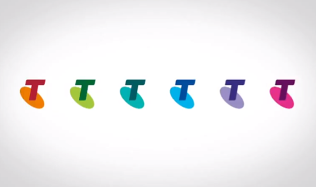
Out with the orange and blue and in with the spinning wheel of death? Telstra has just launched its new youth-skewed brand identity, which, for a reported cost of $3m (yep), is quite like its old identity except for a multicoloured logo scheme by DDB Sydney’s Interbrand. Opting for hues in magenta, pink and teal, the logo is said to communicate a renewed emotional connection with its customers plus a stronger focus on customer services with the recent launch of round the clock trouble shooting via its social media channels and a dedicated website where you can crowd source tech advice. Considered the brand’s biggest change since it dropped the Telecom moniker in ’93, the logos will be applied across uniforms, service vehicles and packaging with its half dozen permutations – orange, aqua, green, purple, blue and pink – representing different sections of Telstra’s customer base.
Telstra chief executive David Thodey told shareholders of the rebrand last week: “Our future is our appeal to the younger generation and I would agree with you that our image is not hitting that market and . . . it has lost its cutting edge,”.
DDB Group CEO Marty O’Halloran echoed those sentiments: “Telstra is one of Australia’s biggest, most recognisable brands. Our challenge was to maintain that familiarity, while also encouraging customers to re-evaluate what Telstra is about,” he said. “Aspects of people’s lives are not any one colour, so injecting the existing branding with a full colour wardrobe means that we can take the Telstra brand to customers in a recognisable, relevant and engaging way.”
The logo is backed by a wistful TVC – Life In Full Colour – which equates the strength of your internet connection to the strength of your terribly maintained relationships (aka every telco brand message since 2001). Watch it below…
RIP blue and orange…