Earlier today, the World Health Organisation released its latest ‘Global Status Report’ on alcohol-related deaths and diseases, and called on governments around the world to do more in order to tackle this problem. The report includes some disturbing figures, claiming that alcohol accounts for 3.3 million deaths each year, and that worldwide, 16% of drinkers engage in heavy, episodic or ‘binge’ drinking.
Amongst other findings, the report noted that, while men are traditionally heavier drinkers, alcohol consumption is on the rise among women around the world, and that per capita, Europe is the region that consumes the most alcohol. 38% of the world’s population are drinkers, and those who are, on average, drink 17 litres of pure alcohol annually.
Unfortunately, the ‘Global Status Report’ is very vague when it comes Australia‘s current drinking habits, and sheds little to no light on how we’re placed in 2014. The report shows that the most up-to-date data in this region comes from 2010, which is actually a lifetime when it comes to the whys and wherefores of how Aussies like to sink piss.
In addition to this, if you read the data closely, a lot of the numbers concerning Australia’s drinking habits in the period to 2010 come under the category of ‘Unrecorded’ consumption, ie “that which is not recorded in official statistics.” ‘Unrecorded consumption’ refers to things like home brews, illegal stills, bathtubs full of prohibition era gin and the like.
The figures show that ‘unrecorded consumption’ of pure alcohol rose by an astounding 1.7 litres per capita in the period 2008 to 2010, but the report sheds very little light on how the WHO actually arrived at this conclusion.
The figures, broken down by country, can be found here, and the document is an interesting read, but I guess the moral of the story is to be wary of anyone trying to quote it back at you, because the numbers are a few years old and probably don’t reflect the actual situation in Australia right now.
via: World Health Organisation
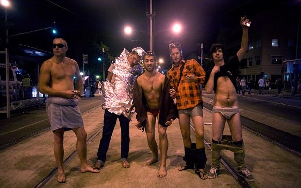
Photo: Kristian Dowling via Getty Images


