In all likelihood, you’ve already made your mind up as to how you’re going to vote this weekend. You know the issues that are important to you and you have your beliefs as to what extent the various parties will address these issues. Hell, you might have even looked into which of the minor parties are the good ones and which minor parties are shit but have unassuming names. Outside of spending countless hours trawling through the social media profiles of hundreds of candidates to see if they’ve ever posted an image of a horny centaur lady, at his point, there’s nothing substantive about the candidates we can offer you to help you decide how to vote. As a result, we’ve moved on to stuff that is not at all substantive.
[jwplayer yd1bmxtv]
Ranking Australia’s worst minor parties based on their policies is hard. How do you decide which is worse between racism and homophobia and xenophobia and Islamophobia and anti-vax nonsense? How do you then rank the parties when a bunch of them contain combinations of those things mixed at different quantities? Simple: By how good they are at graphic design.
For your perusal, Australia’s worst minor parties in descending order of their level of graphic design skill:
Australian Christians
While they might be anti-same-sex marriage, anti-abortion, anti-Safe Schools and in favour of increasing the legal drinking age to 21, you simply cannot besmirch their graphic design skills. The website is nice, and their logo neatly brings in multiple elements to an easily reproducible and recognisable shape:
![]()
You win this time, Australian Christians.
Christian Democratic Party
I will not mince my words here: Fred Nile is a real fuck. The man is just a big ol’ turd. He sucks, is what I’m saying. His party does, too. But I simply cannot speak ill of their graphic design. The website, while nothing to write home about, is clean and simple, and the branding is consistent and tasteful throughout their social media posts. They only come in at slightly worse than the Australian Christians because of the horrible fireworks effects on this Facebook video.
Australian Conservatives
Cory Bernardi jumped ship from the Liberal Party in the hopes of having his own approximation of a Trump moment, buoyed to political success by a ‘silent majority’ of far-right voters in the country. As you can maybe tell by how you haven’t heard or thought of him for a while until right now, this did not eventuate. Bernardi and his very minor minor party were quickly relegated to obscurity when the sliver of racists that he might have energised instead found their hero in Fraser Anning, a man with quite similar views to Bernardi who is just more willing to say the racist parts out loud. There’s not much to critique in the Australian Conservatives — Bernardi has plugged red, blue, and white into a generic website template and carried that theme through his videos. Their graphic design, like Cory Bernardi, is wholly unremarkable, and not particularly worth paying attention to.

United Australia Party
There are two things that Clive Palmer loves: not paying his workers, and the colour yellow. While his all-yellow-everything approach might be a good branding exercise, I’m almost certain that the precise shade of yellow he’s chosen is one that was made illegal because it causes schizophrenia in lab mice.
Citizens Electoral Council
It’s hard to say what’s more worrying about the Citizens Electoral Council — the allegations of anti-semitism or their logo! (Just kidding, it is not hard to say.)

Yellow Vest Australia
In a not at all confusing move, the far-right party Australian Liberty Alliance decided to rebrand as Yellow Vest Australia, attempting to co-opt the French economic justice movement into one about Islam. Somehow, they thought this logo would make things less confusing:

Australia First Party
Nestled amongst their unbelievably long screeds on the history of the White Australia policy and their policy sections outlining why they would like to return to that, the Australia First Party shows off their incredible graphic design prowess with imagery like the following:
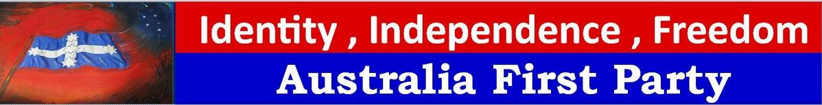
Just beautiful stuff.
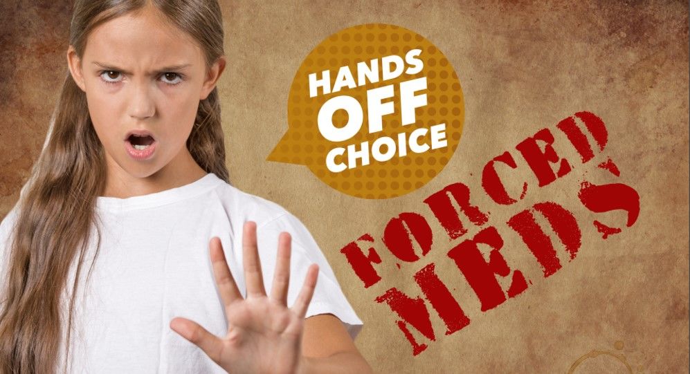
Involuntary Medication Objectors (Vaccination/Fluoride) Party
I’m not sure if you can tell just by looking at the name of the Involuntary Medication Objectors (Vaccination/Fluoride) Party, but the AEC imposes a strict six-word limit on the length of party names. In those six words, the IMHO(V/F)P have very much summed up what they’re about. If that’s not enough, take a look at their very subtle logo:
![]()
Their graphic design exploits aren’t limited to logos, they’ve also prepared these handy images which outline their position on ‘forced meds’ (vaccines):

Conservative National Party
Probably the nicest thing you could say about Fraser Anning is that his graphic design sucks. Not only is his party a ragtag ensemble of racist fuckheads, they’re also terrible at using Photoshop (you can read more about the far-right origins of how white South African farmers found their way into Aussie politics here):

Climate Action! Immigration Action! Accountable Politicians!
Much like the Involuntary Medication Objectors, Climate Action! Immigration Action! Accountable Politicians! are a result of people really maxing out that six-word limit. And much like Yellow Vest Australia, they’re also the result of a recent name change. They were formerly known as Online Direct Democracy, which you might be able to tell from the logo which they have retained:

The party formerly known as Online Direct Democracy is substantially more benign than the other parties on this list in terms of policy (direct democracy isn’t harmful or immoral, it just sucks), but the graphic design is not good.
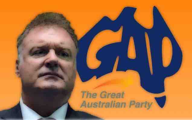
Great Australia Party
Former One Nation senator Rod Culleton simply cannot be stopped. He is a man who genuinely does not understand the words ‘You are not a senator.’ Now, striking out on his own, he has brought his own visual flair to his latest political undertaking:

The man just loves a filter:

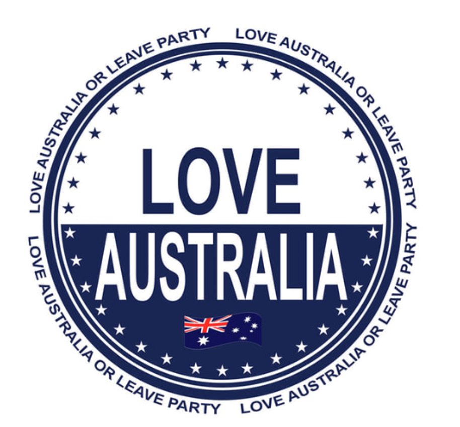
Love Australia or Leave
If you haven’t heard of Love Australia or Leave, rest assured that there is nothing about them that you couldn’t infer just from seeing the name — one which I presume they settled on after the AEC knocked back ‘Fuck Off We’re Full’. The people at Love Australia or Leave have refused to welcome both immigrants and also help with the computer from their kids. Look at this travesty of a logo:
Hard to say if that one is better or worse than this version:

They’ve also tried their hand at what could maybe generously be called the meme game:

Rise Up Australia
And last but not least, we arrive at Rise Up Australia, another one of the country’s very many anti-Islam minor parties. There are lots of examples of their awful handiwork but, really, I think this book cover from Rise Up Australia founder Daniel Nalliah takes the cake:

Gorgeous.


