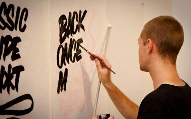
GO FONT UR SELF*, the traveling art exhibition dedicated to all things type, was born from creator Marty Routledge‘s mad love of letterforms. In just two years Routledge’s brainchild has evolved from a pretty good idea into a massive project involving 84 acclaimed local and international artists, 17 exhibitions across four capital cities, a couple of books and a shitload of Kirins (the show’s ongoing sponsor and purveyor of crisp Japanese ale). After launching the exhibition’s sixth chapter at Brisbane’s Nine Lives Gallery on April 4, the exhibition (which features a gobsmacking lineup) is headed for one-night-only jaunts in Sydney followed by stops in Adelaide and Melbourne. Pedestrian recently spoke to Marty about the genesis, perks and pains of running his type-dedicated art show, and talked us through five of his favourite pieces (below) that have featured in the show.
“GFUS started out as a show for me, my brother and a bunch of my Sydney mates who were all doing the circuit: Beastman, Nusmkull, Woodley, Frosty, etc, but Peergroup (the marketing and events company for whom Marty is art director) had plans to escalate the idea into a tour and a series a three a year. It really goes to show that an Idea has the potential to be a lot bigger than you think.”
Routledge’s hand presides over every aspect of Go Font Ur Self* from selecting the artists and liaising with sponsors, to the operational stuff like organising prints, freight, framing and installation, to sales, promotion, PR, collecting database, designing books, and putting decals on gallery walls and windows.
“The only difficulties I face are logistical ones,” he said. “Freight delivery, artwork deadlines, sponsors, tour date co-ordination, relationships… Other than that with the people I work for it has all been easier than I thought. If you’re a problem solver this sort of thing comes naturally.”
But why the focus on type, specifically? Marty explained: “it’s a common theme for every human on this earth, we use it everyday and often don’t notice its history, the time periods they represent, how far it can be pushed whist still remaining letters. And being from a graffiti background with a HEAVY skew towards lettering, everything I have ever created for my own work has been letter based.”
Artists that have lent their typographic talents to GFUS include Above, Yok, Mike Giant, Bones, Siggi Eggertsson and Lachie Goldsworthy to name a few, each one handpicked by Routledge: “I select artists based on my wish list of heroes in the visual arts. I email them and ask them to participate. If they do, great. If not, I’ll try them again next time. Persistance is key!”
Michael Doret “What a wonderful world” (Cali, USA)
I have been obsessed with the NBA basketball since I was a kid. As the dreams of playing bball in the states died, and design and painting walls became my focus, I started looking into the basketball logos, and who created them. I have always loved the NY Knicks logo, and when I found out that the man responsible for the most current logo was still around and actively designing type work It wouldve been rude not to ask. He is a talented gentleman, who has also done many landmark icons from univewrsal hollywood, signs for rides at disneyland, covers for TIME magazine amongst many other fuckin cool projects. He is an older guy, and was making signage style type faces before it became all cool! I love this piece for its screen printed charmingly incorrect registration highlights. Its a lyric from louis Armstrong.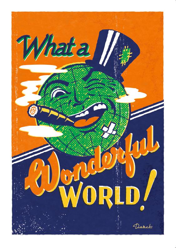
Luke Lucas – “Just My Type” (Victoria, Australia)
Luke and I have very similar aspirations and taste and so much so that our type shows came out in 2009 about a month out from each other. Purely co-incidental, seemed, we both felt that it was an area that deserved celebration and an artform that was on the rise in practice and popularity again. Luke is the Creative director at Life Lounge, and needless to say they have done amazing work over the years with their magazines and agency work. I think It took a while to convince luke that I wasn’t competition, but alliance, and in the last series was stoked to convince him to make some time and get on the list. His piece is amazing, all of his type is very well considered and well executed. It has no fancy colour ways, but just a really tight execution and a modest treatment that works very very well. Oh and it proudly boasts a commonly used typography, Pun, which I’m sure you may have guessed we are all about that here at GFUS.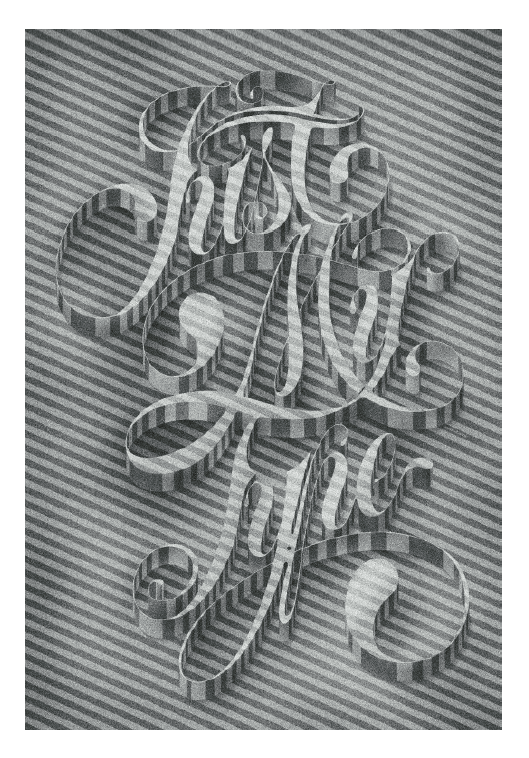
Rob Abell “This ‘n’ That” (Victoria, Australia)
Rob is an old friend of mine from Melbourne that I met through an old painting mate who wrote ACRE or 1CRE, we did a few walls together, and I knew he had moved to sydney to start tattooing for Josh Roelink at Tattudharma. He moved back to Melbs to work for other heavy hitter in the tattoo game Trevor Mcstay at Dynamic in Richmond. He has tattooed me a bunch of times, in his style with my concepts, he is such a talented artist and such a chiller. His background with graffiti has definitely added to his career now as a full time tatooist. Love his piece as it is so tattoo, and not trying to be anything else. You could put that straight onto someone and it would work perfectly.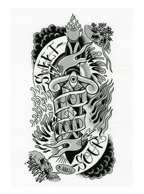
Timba Smits “Fontopoly” (London United Kingdom)
Timba is kinda like me but taller. I am already 6’3 so he is one big bastard. From Melbourne originally Timba runs Wooden Toy magazine, also runs a type show called LYRICS AND TYPE, and works as a freelance designer. I first saw Timba in person talking at semi permanent a few years ago. It seemed amazing that a guy my age was confident to talk to that many people about his work. He seemed really on point as a human, and im all about people like that that bite off more that they can chew and get it all done so well. This piece is a great take on the monopoly board game and is definitely skewed to Font enthusiasts who understand all the lingo, and experiances of being a typographer. A lot of in jokes in there. Also always picking boss colourways so simple and so nice. This was the most sold piece of gfus.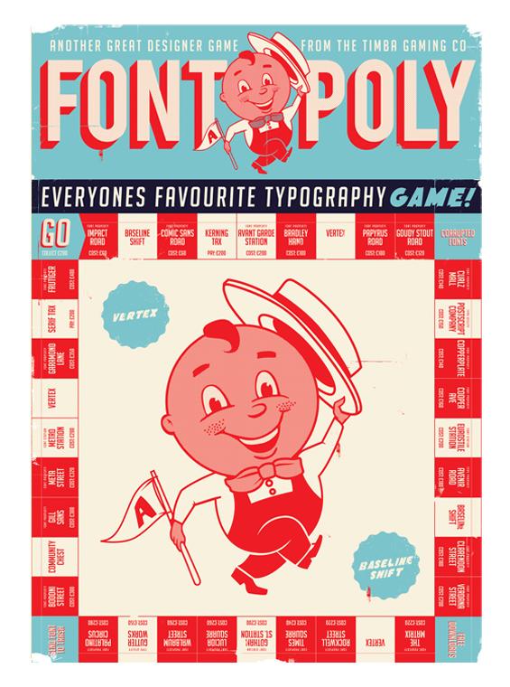
5. TRAVIS MILLARD “Mind the lads” (Los Angeles, USA)
Travis is a super talented illustrator based in the states, I mean the guy sells his work to people like george lucas (star wars)… Travis and Mel (kadel) were out here not long ago for Semi Permanent also. A good friends of mine Kill Pixie knew them from the same suburb in LA, so whilst he was here at the same time we all went to the shakey for dinner. Me and pixie started explaining the concept of ‘ADLAYS’ to Travis and mel who were confused to say the least. They were really intrigued about the almost Sydney exclusive club that is ‘Lads’. The way they talk, what they wear, what they get up to. This submission was purely a result of our t-bone steak night mid last year. So maybe a little bit of an in joke again, but done in travs style as a commentary piece of sydney was sooooo stoked. 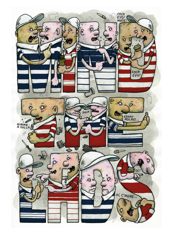
GO FONT UR SELF* Dates
Sydney: 6pm, Thursday 28 April
Roller Studio at 6 Lacey Street, Surry Hills
Adelaide: 6pm, Wednesday 18 May
MagaZine at Clubhouse Lane, Adelaide
Melbourne: 6pm, Thursday 9 July
No Vacancy at 34-40 Jane Bell Lane, Melbourne (entrance off Russell Street)
Visit http://www.gofonturself.com.au for more.