Zara is one of those brands with a logo so recognisable, it’s got prime position on practically every major shopping street in the world. Honestly, when I’m overseas and feel a little lost, I draw comfort as soon as I spot the four letter word emblazoned on the side of buildings, in much the same way I welcome a Maccas when I’m feeling a little homesick.
But that logo is about to look extremely unrecognisable, with the Spanish high street hero debuting a completely different logo this week. Aside from feeling slightly debased by the switch up, the internet is also unsure how to feel about the new design. Why? Because it looks a bit bloody weird.
[jwplayer dQbTv2Xh]
To refresh your memory, this is the Zara logo we all know and love:

Aaaaand here’s the new look logo that’s just made its way onto the brand’s site and social media:

Our immediate reaction:

Twitter was quick to express its feelings on the redesign, and the dominant reaction was a combination of surprise and discomfort. In fact, you can easily trace the internet’s journey through the seven stages of grief.
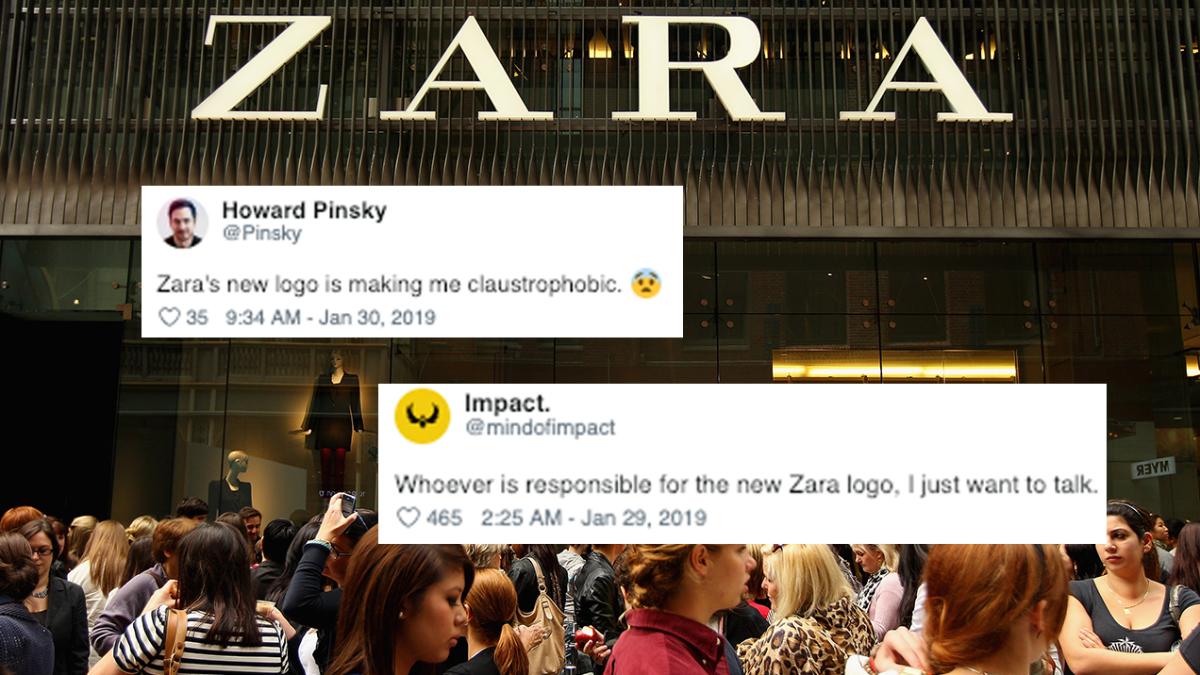
First comes shock and denial:
Zara’s new logo is making me claustrophobic. 😨 pic.twitter.com/uSHylbzNCH
— Howard Pinsky (@Pinsky) January 29, 2019
“Zara’s new logo is making me claustrophobic” wrote one user.
The new Zara logo is giving me anxiety I- pic.twitter.com/CdENLIT2LC
— suha⁷ (@vthluvr) January 30, 2019
“The new Zara logo is giving me anxiety I-” added another.
Next is pain and guilt:
Zara yet again changes its logo! I mean I love the brand itself and their clothing but really disappointed about their 2019 logo. Srill want to read about the intensions behind it before I give my feedback. pic.twitter.com/23WJIjLdOC
— Maher Sinjary (@mahersinjary) January 27, 2019
Followed by anger and bargaining:
Whoever is responsible for the new Zara logo, I just want to talk. pic.twitter.com/DHoff5pLBT
— Impact. (@mindofimpact) January 28, 2019
“Whoever is responsible for the new Zara logo, I just want to talk.”
Depression and reflection:
The new Zara logo is actually me trying to squeeze into their clothes…😰 pic.twitter.com/KNBR5BHg4F
— Keyser Jöse (@captl_P) January 29, 2019
“The new Zara logo is actually me trying to squeeze into their clothes…”
Then comes the upwards turn:
The new Zara’s logo is a prime example of a kerning overdose. pic.twitter.com/hVBmeeDApU
— John Luke (@johnlukecom) January 28, 2019
“The new Zara’s logo is a prime example of a kerning overdose.”
Working through the pain using humour:
User’s: the new Slack logo was awful
ZARA: hold my beer… pic.twitter.com/8NmOK3Pqfp
— Abdulsamad Umar (@justabdulsamad) January 27, 2019
“User’s: The new Slack logo was awful. ZARA: holy my beer…”
And, finally, acceptance and hope:
I actually like @ZARA ‘s new logo. Am I the only one?! pic.twitter.com/APodWa7c3p
— Kipola (@wakilongokipola) January 30, 2019