You might have seen Redman’s work everywhere that’s anywhere lately, with previous collabs in 2010 with LVMH tastemakers Nowness and the universal epicenter of retail chic, colette, under his technicolor belt. Redman (and Maier) have also worked with Vogue, New York Magazine, Apple, Nike, Microsoft, Zimmerman and Antipodium, as well as US-based retail it-kids and Kenzo creative directors Humberto Leon and Carol Lim, of Opening Ceremony fame, for a series of online illustrations recently for Halloween.
Similarly, for their Spring Summer 2011 campaign, Oroton recently teamed up with street-style savant, Tommy Ton of Jak & Jil and his frequent subject, the well-accessorized, well-documented stylist, Amazonian ex-accessories director for Marie Claire US, Taylor Tomasi Hill. That’s some good company they’re keeping there.
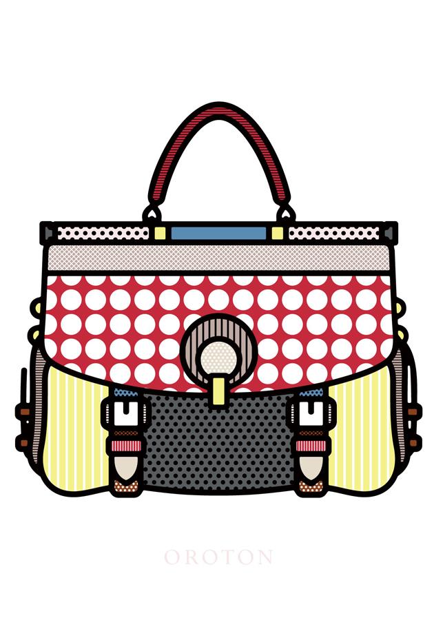
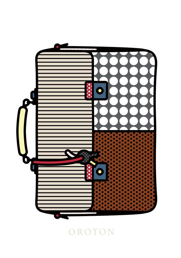
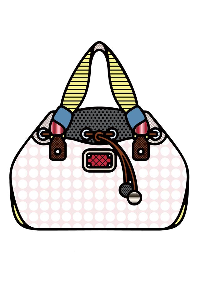
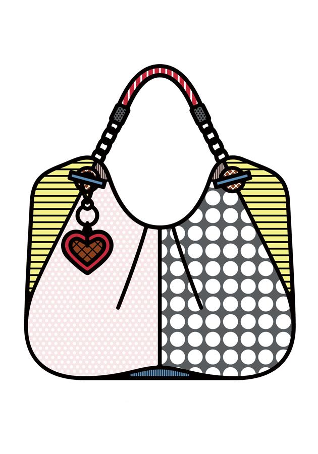
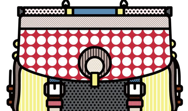
Where Ton’s Oroton campaign focused on the accessories in their (highly-stylised) natural environment, Redman’s also sees a translation of his aesthetic into the campaign’s imagery through its strong, graphic lines delineating between vibrant blocks of colour and print.
“We wanted to create a campaign that focused less on typical photographs of products and was more about creating a new overall feel for the brand. Even though the imagery does use specific products, it’s more about giving those products a personality that people can connect to. I’ve been experimenting with a series of portraits over the last few years and together we decided this particular style might be cool to trial out on the bags and accessories. I used heavier, looser, back outlines mixed with precise, geometric pattern fills and blocks of colour that create an interesting juxtaposition,” explained Redman. “Oroton and I set out to get a visceral reaction, the campaign is bright, bold, fun and ultimately intended to make you happy.“
The fruits of their collective labour, four posters based on the favourite pieces of both Redman and Oroton Creative Director Ana Maria Escobar selected from the collection, will appear in oversized, unfinished – so as to impart an industrial feel – neon light boxes in the brand’s stores. Like Redman’s Pop aesthetic, the Vis Merch was designed with that beacon of neon light personified, Andy Warhol.
Desired effect achieved? Are you happy, style-hungry masses?