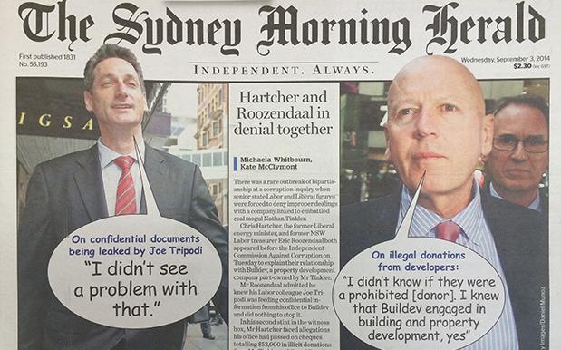
Former NSW Treasurer Eric Roozendaal has admitted to an ICAC hearing that he was was pretty chill with his former Labor colleague Joe Tripodi leaking confidential state documents to a wealthy mining magnate but WHO EVEN CARES because The Sydney Morning Herald have used Comic Sans and Word ’97 Clip Art speech bubbles on the front page of today’s newspaper.
‘SMDH‘
“I didn’t see a problem with it”, Roozendaal told yesterday’s hearing, describing how he was unfazed by the leaking of information to a construction company who stood to make tens of millions in profit from the construction of a coal terminal in Newcastle.
‘But, like, Comic Sans tho! Can you even!?‘
It’s fitting then that Roozendaal’s nonplussed vibe and extremely questionable approach to running the State Treasury should be echoed in the sentiments of Editor-in-Chief Darren Goodsir, who this morning came to the defence of the much-maligned font and who also doesn’t see a problem with using the typeface more Shiba Inus prefer on the front page of one of the country’s more venerable print publications.
If anything, it’s actually a very fitting typographical choice when you’re dealing with conduct – dare we say, extremely corrupt conduct – of the kind that has lead to two politicians facing an ICAC hearing.
It also doesn’t hurt that today, more than ever, people are actually paying attention in some way, no matter how small, to what’s on the front page of The Sydney Morning Herald.
All publicity.
Love that comic sans. Under-rated font! @rickeyre @bencubby. Appalled by ex Treasurer’s claims he was cool with leaked documents. Outrage!
— Darren Goodsir (@sirgooddarren) September 2, 2014