Have you ever wondered who’s mentioned the most during Oscar winners’ acceptance speeches? Yeah, me neither, but one bloke certainly has, and he even made it into a sweet little chart.
[jwplayer Xo5Pp7Pz]
Zev Youra is a self-described movie nerd and lover of data, so it makes sense that he would somehow combine the two. To create the charts, Youra used Oscars’ transcripts which are freely available online to analyse and display the data visually for all sorts of topics, like screenings by film rating, length of acceptance speeches by category, and of course, who gets mentioned in the speeches.
You can check out the latter chart below, which uses speeches from 1960 through to 2017.
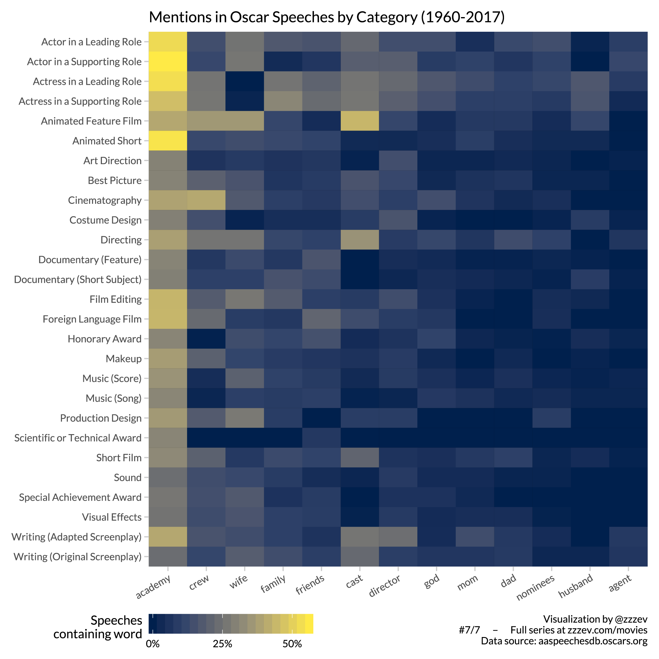
The Academy is certainly a popular shoutout on all fronts, but it’s also interesting to see certain outliers in the data, like how winners of the Animated Feature Film category are more likely to mention the film’s cast than any others.
Youra posted the chart to the subreddit, Data is Beautiful, where it has around 10,000 upvotes at the time of writing. It also sits on his own website, along with some of his other work.
“I am a software developer turned generalist maker-of-things, based in Los Angeles,” his About page reads. “I’m particularly interested in data visualization, journalism, generative art, and our world’s slow slide into dystopia.”
“From 2014-18, I worked at Google on data visualization for advertisers and coding education. Before that I worked at Zynga and received a BS in Computer Science from the University of Michigan.”
In other words, old mate knows a thing or two about how to turn data into visual representations. You can check out more of his movie-related charts here.
Need a new podcast binge? In Pedestrian’s ‘Decoding The Modern World’, Stacey June tackles the challenges of dating, working and simply existing in 2019.